Candlestick Trading Strategies

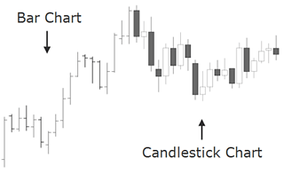
The Japanese candlestick chart is considered to be quite related to the bar chart as it also shows the four main price levels for a given time period. So, what makes them the favorite chart form among most Forex traders? The answer is that candles have a lot of qualities which make it easier to understand what price is up to, leading traders to quicker and more profitable trading decisions. Japanese candlestick charts are believed to be one of the oldest types of charts in the world. It was originally developed in Japan, several centuries ago, for the purpose of price prediction in one of the world's first futures markets. Below you will find a dissection of 12 major signals to learn how to use Japanese candlesticks.
Learning candle patterns in groups is much like recognizing family members. If a large number of relatives were disbursed in a crowd of strangers it would be easy to miss them.
However, if the relatives were all brought forward and arranged by family units it would become rather easy to spot them, even if they were dispersed back into the crowd again.
Candlesticks, like relatives, can be grouped together and learned in family groups. They can be directly related or cousins. As in any family some of the cousins can be a bit odd, but in perspective they still fit and are much easier to remember if they can be placed into a family.
Candlestick patterns have very strict definitions, but there are many variations to the named patterns, and the Japanese did not give names to patterns that were 'really close'.
Experience and common sense allow traders to read the message even if it does not exactly match the picture or definition in the book.
The line chart is the simplest form of depicting price changes over a period of time. The line is graphed by depicting a series of single points, usually closing prices of the time interval. This simple charting method makes easier the assessment of the direction of a trend, or the comparison of the prices of multiple instruments on the same graph.
The Japanese candlestick chart is considered to be quite related to the bar chart as it also shows the four main price levels for a given time period. Candles have a lot of qualities which make it easier to understand what price is up to, leading traders to quicker and more profitable trading decisions. Japanese candlestick charts are believed to be one of the oldest types of charts, developed in Japan several centuries ago for the purpose of price prediction in one of the world's first futures markets. In the 18th century, Munehisa Homma become a legendary rice trader and gained a huge fortune using candlestick analysis. He discovered that although supply and demand influenced the price of rice, markets were also strongly influenced by the emotions of participating buyers and sellers. Homma realized that he could capitalize on the understanding of the market's emotional state. Even today, this aspect is something difficult to grasp for most aspiring traders. Homma's edge, so to say what helped him predict the future prices, was his understanding that there is a vast difference between the value of something and its price. The same difference between price and value is valid today with currencies, as it was with rice in Japan centuries ago. Compared to the line and bar charts, candlesticks show an easier to understand illustration of the ongoing imbalances of supply and demand. They also speak volumes about the psychological and emotional state of traders, which is an extremely important aspect we shall cover in this chapter.
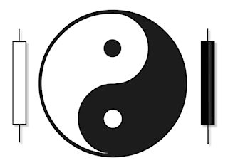
One advantage is that in Forex candlestick charts, candles are colored accordingly to the direction of price movement: when the open rate is higher than the closing rate the candlestick is colored with a “filled-in” body, and when the candlestick shows a “hollow” body, that means the closing rate exceeds the opening rate. The body of the candlestick, also called the “real” body, represents the range between the open and closing prices. In a quick view, you notice in which direction, if any, the price is heading. This is just one of the multiple conventions and the one we will use here, as each charting service may color the bullish and bearish candles differently. Below is an example of candlesticks and a definition for each candlestick component. The solid part is the body of the candlestick. The lines at the top and bottom are the upper and lower wicks, also called tails or shadows. The very peak of a candle's wick is the highest price for that time period, while the bottom of the wick is the lowest price for that particular time period. Another advantage of using a candlestick chart is that you may combine them with conventional market indicators such as moving averages and trendlines. But the most outstanding advantage these charts offer are the early warning signs when changes in trends occur.

Before you can understand trading strategies and candlesticks, you must have a solid understanding of what is behind the creation of candlesticks. There are many conventional candlestick patterns in use today by traders around the globe. If they all worked and trading was that easy, everyone would be very profitable. The reality is that most traders lose money. One of the main reasons they lose is because they don't understand what candlesticks represent which is an ongoing supply and demand equation. During this session, we will spend time looking at candles not through the eye's of conventional candlestick patterns but instead through the eye's of supply, demand and orderflow.
Some traders seem put off by the language that surrounds candlestick charts. But it's quite simple actually: the names of the patterns will often tell you what message is inherent to it. Originally, candlestick formations were labeled accordingly, in part, to the military environment of the Japanese feudal system during that time. Therefore you will find terms such as as “piercing”, “thrusting” and “advancing three soldiers” which definitely reflect a military cast. But candles were also given other more mystical names which may sound unusual at first but which are actually very descriptive like the “dragon fly” or “morning star”. Steve Nison, in one of his books about the topic, explains:
A fascinating attribute to candle charts is that the names of the candlestick patterns are a colorful mechanism describing the emotional health of the market at the time these patterns are formed. After hearing the expression “dark-cloud cover”, would you think the market is in an emotionally healthy state? Of course not! […] this is a bearish pattern and the name clearly conveys the unhealthy state of the market. […] The descriptive names employed by the Japanese not only make candle charting fun, but easier to remember if the patterns are bullish or bearish. For example,[...] the “evening star” and the “morning star”. Without knowing what these patterns look like or what they imply for the market, just by hearing their names, which do you think is bullish and which is bearish?
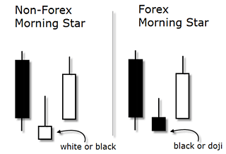
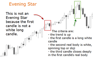
The evening star (the nickname for the planet Venus), which comes out before darkness sets in, sounds like the bearish signal - and so it is! The morning star, then, is bullish since the morning start (the planet Mercury) appears just before sunrise.
Source: “Japanese Candlestick Charting Techniques, A Contemporary Guide To The Ancient Investment Techniques Of The Far East” by Steve Nison, Prentice Hall Press, Second Edition, 2001.
Out of a universe of dozens of candlestick patterns, it has been found that a small group of them provide more trade opportunities than most traders will be able to utilize. In this section, 12 patterns are dissected and studied, with the intention to offer you enough insight into a fascinating way to read price action. The following is a list of the selected candlestick patterns.
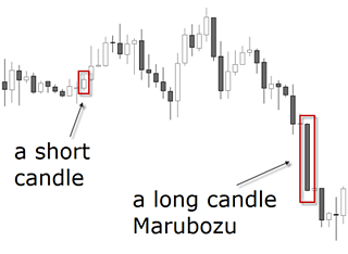
Although this candle is not one of the most mentioned ones, it's a good starting point to differentiate long candles from short candles. A marubozu is a single candlestick pattern which has a very long body compared to other candles. Although this is considered a confirmation of the market's direction, it suggests to enter the move when the price has already moved a lot. The resulting risk associated with this signal makes the marubozu not so popular compared to other candlesticks.
It signals a strong buying when the close is significantly above the open, and vice versa when the candle is bearish. A short candle is of course just the opposite and usually indicates slowdown and consolidation. It occurs when trading has been confined to a narrow price range during the time span of the candle.
The smaller the real body of the candle is, the less importance is given to its color whether it is bullish or bearish. Notice how the marubozu is represented by a long body candlestick that doesn't contain any shadows.
Despite the odds of a market turn increasing with a doji, it still lacks a confirmation to be traded upon. Doji's are formed when the session opens and closes at the same level. This pattern indicates there is a lot of indecision about what should be the value of a currency pair. Depending on the shape of the shadows, dojis can be divided into different formations:
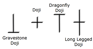
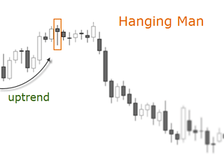
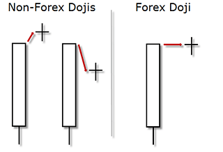
A long legged doji candlestick forms when the open and close prices are equal. The dragonfly doji shows a session with a high opening price, which then experiences a notable decline until a renewed demand brings the price back to finish the session at the same price at which it opened. At the top of a trend, it becomes a variation of the hanging man; and at the bottom of a trend, it becomes a kind of hammer. It is thus seen as a bullish signal rather than neutral. The gravestone doji's are the opposite of the dragonfly doji. Appropriately named, they are supposed to forecast losses for the base currency, because any gain is lost by the session's end, a sure sign of weakness. The Japanese analogy is that it represents those who have died in battle. Dragonfly and gravestone dojis are two general exceptions to the assertion that dojis by themselves are neutral. In most Candle books you will see the dojis with a gap down or up in relation to the previous session. In Forex, nonetheless, the dojis will look a bit different as shown in the picture below.
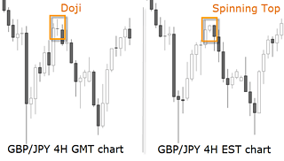
How can I deal with the fact that different charting platforms show different candlestick patterns because of their time zone? Forex market, we would suggest to use a GMT chart since most institutional volume is handled in London. This is specially valid if you work with daily charts but intraday charts superior to 1 hour will also show differences in the patterns. In any case, because of the 24 hour nature of the Forex market, the candlestick interpretation demands a certain flexibility and adaptation. You will see how some of the textbook patterns look slightly different in Forex than in other markets.
The following patterns are thought to alert the trained eye of pending reversals offering the chance to the trader to get early on a possible new trend, or to alert the trader who is already in the money that the trend is ending and the position demand to be managed.
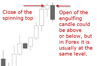
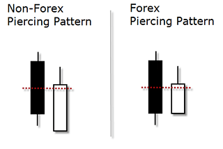
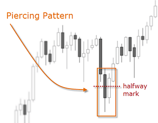
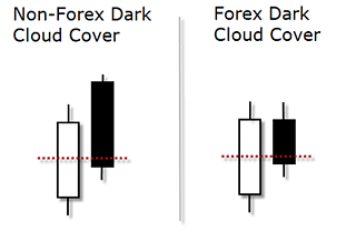
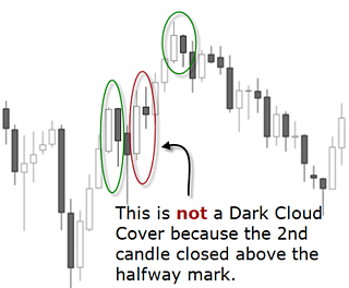
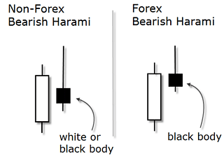
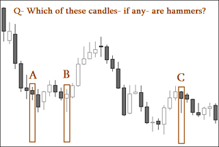
There are few patterns where the shadows play a major role than the body. One of these are hammers, which is comprised of one single candle. It is called so because the Japanese will say the market is trying to hammer out a base. A hammer pictorially displays that the market opened near its high, sold off during the session, then rallied sharply to close well above the extreme low. Note it can close slightly above or below the open price, in both cases it would fulfill the criteria. Because of this strong demand at the bottom, it is considered a bottom reversal signal.
A perfect hammer in Forex is the same as in any other market: its tail must be twice as large as the length of the body and the body has to be near or at the top of the candle. This means it can have a little upper shadow, but it has to be much smaller than the lower shadow. The smaller the body and the longer the tail, the more significant the interpretation of the hammer as a bullish signal. Another important criteria is the color of the body: the candlestick can be bullish or bearish, it doesn't matter.
Most patterns have some flexibility so much more illustrations would be required to show all the possible variations. This is what we attempt to do in the Practice Chapter. The illustration below is a sample question taken from the Practice Chapter's assessment. There you will find dozens of real case studies to interpret and answer. Each example will show a detailed explanation of the correct answer so that you can really integrate this knowledge in your trading. Remember: practice is one of the keys to success in Forex trading.
