Stock market deep dive
This week has seen a torrent of earnings releases, corporate news and price action so it can be worth breaking it down to see what’s going on and what may continue to drive markets in the coming days and weeks.
Below, we have broken down some interesting stats on key global equity markets, that may help to determine where markets go next.
Number of weekly advancers and decliners
As you can see, the % of weekly advancers is greatest for the FTSE 100, the CAC 40 and the Dow Jones. These are indices that don’t have much tech in them. This signals that investors favoured stocks beyond tech last week, could this be the start of a broader rally for US and European stocks? European stocks also performed better on a weekly basis than their US counterparts. While one week of data does not make a trend, we are at an interesting moment in the current cycle for stock markets. Could this be a sign that the market might start favouring cheaper European stocks over their US counterparts?

Source: Bloomberg and XTB
% of stocks above their 50-day moving average
A 50-day SMA is a useful indicator, since it shows the trend of the stock and also its strength or weakness. This is considered the first step in an uptrend, and can act as a useful support line, as it is a level that prices may not usually breach in the event of a stock market pullback. As you can see, the Dow and the S&P 500 have the largest % of stocks above their 50-day SMA, as you would expect for indices that have made fresh record highs in recent weeks. The Nasdaq doesn’t have a particularly high % of stocks above their 50-day sma, which is a sign that the rally in the Nasdaq is particularly concentrated. There are also some notable underperformers in the Nasdaq so far this year, for example Tesla, which is weighing on the index. In Europe, the FTSE 100 has 64% of members above their 50-day sma, and in the Eurostoxx this is 56%. Since the FTSE 100 has had the highest % of weekly gainers, this metric could play catch up in the coming days. However, this indicator suggests that upside momentum remains strong for the Dow, the S&P 500 and the Cac, even if the US indices have seen a weaker performance this week.
-638418785638203398.png)
Source: Bloomberg and XTB
% of new weekly highs, four, 24 and 52 week
The % of new weekly highs indicator is useful, since it can show us market breadth. Positive market breadth can indicate a bull market, while negative market breadth can be a sign of a bear market or a cheap market. As you can see, apart from the Cac, overall these numbers are low, which suggests two things. Firstly, that the market breadth in US markets is low, and the rally in US stocks is driven by only a small number of stocks. We have spoken about this before, and the tech sector continues to drive US indices. In the UK, the % of stocks making 4,24 and 52 week highs is also low, however, it signifies something different from the US: an unloved index that is fairly cheap. Stocks can be cheap for a reason, and for most of the last year the market has not favoured UK stocks. This week’s strong performance could change things, and we will be watching to see if the FTSE 100 can extend these gains in the coming weeks.
The high numbers for the Cac index in France, suggests that the Cac is having a healthy market rally, which is supportive of this index. The figures for the US are interesting, for most of the last year, the main US stock indices have been rising, yet most stocks within them have not been rising at a notable rate. However, in the last 4 weeks we have seen the % of stocks at 4-week highs rise, which is a sign that there has been a small increase in the breadth of thUS market rally that has driven the S&P 500 to record highs. However, at 7% vs. the Cac’s 25%, it suggests that the S&P 500’s market breadth remains tight as we move through January, and any weakness in the largest tech titans could weigh heavily on US indices, as they are their main driver and the index is market cap weighted, which means the largest companies have a large impact on where the index goes next.
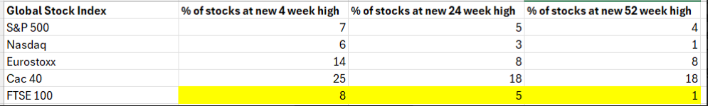
Source: Bloomberg and XTB
The yield curve
The US yield curve looks at the difference between 10-year US Treasury yields – 2-year US yields. The difference is the yield curve and it is a recession indicator. It is not a particularly accurate recession indicator, as you will see. It has been inverted since July 2022. When the yield curve inverts, it can be a warning sign that a recession is on the horizon. Not only has the US avoided a recession, but its economy experienced strong growth, particularly in the second half of 2023. However, this is still an indicator that is worth watching, especially when it looks like it is changing direction. Since the start of the year, this index has been steepening – when 10-year yields are rising faster than 2 -year yields, as expectations rose that the Fed would cut interest rates. However, in recent days, the curve has flattened, which could be a sign that the bond market thinks rate cuts are less likely. This hasn’t fed into interest rate expectations, the market may be pricing out the chance of a rate cut in March, but there are still 6 rate cuts expected in the US this year.
The shift in the yield curve is important for stock markets. If this is an early sign that the market is getting concerned that too much loosening has been priced into the market, then it could knock risk sentiment and trigger a sell off/ volatility in stock markets.
Chart: US yield curve
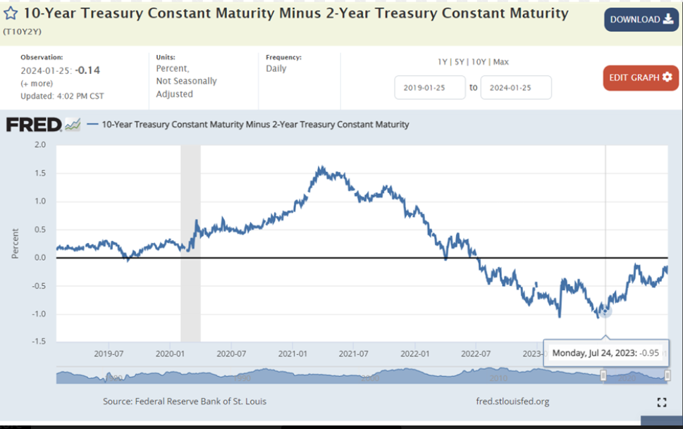
Source: Federal Reserve Bank of St Louis
Premium
You have reached your limit of 3 free articles for this month.
Start your subscription and get access to all our original articles.
Author

Kathleen Brooks
XTB UK
Kathleen has nearly 15 years’ experience working with some of the leading retail trading and investment companies in the City of London.