EUR/USD technical analysis: Sell-off looks likely as a bearish pattern emerges

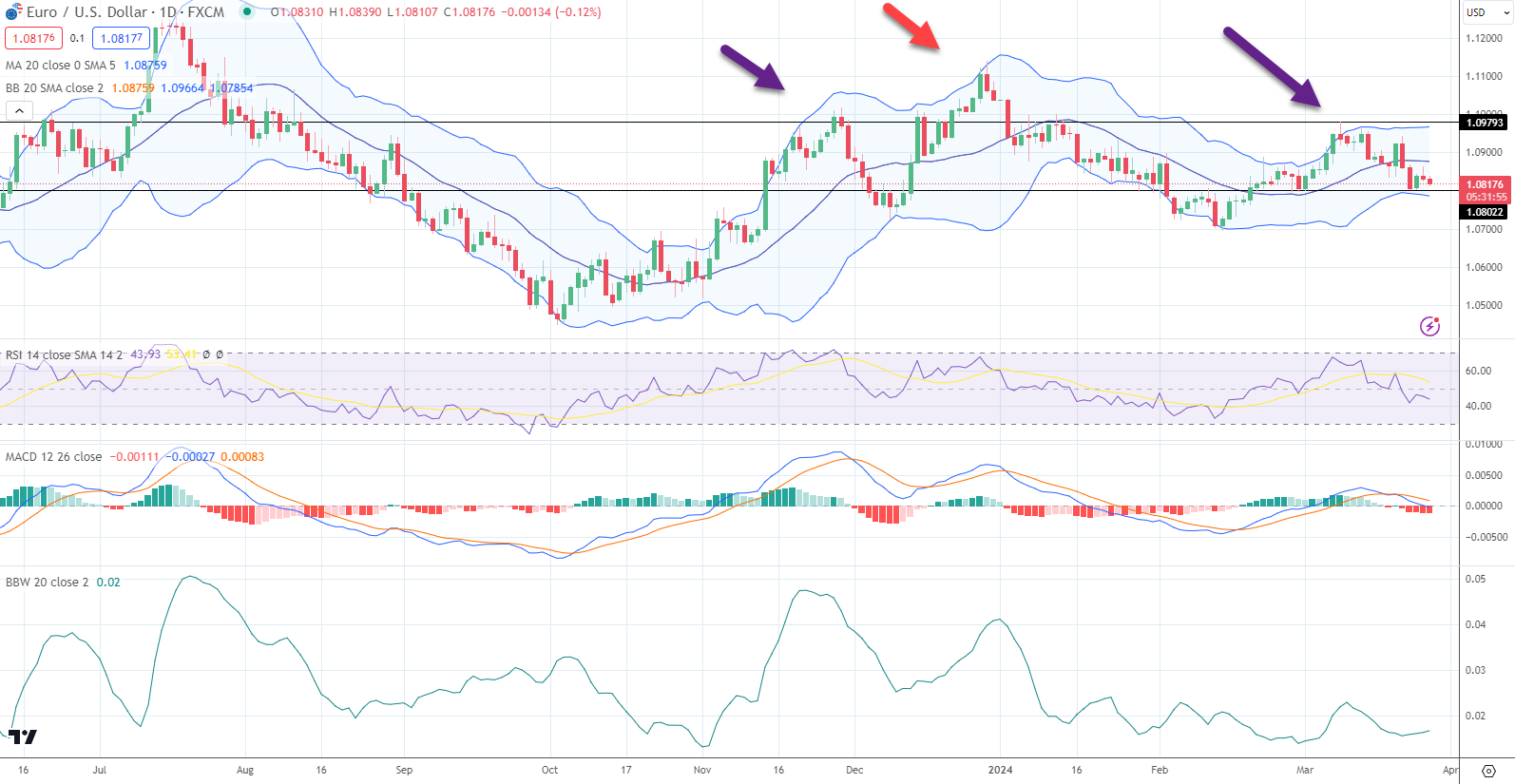
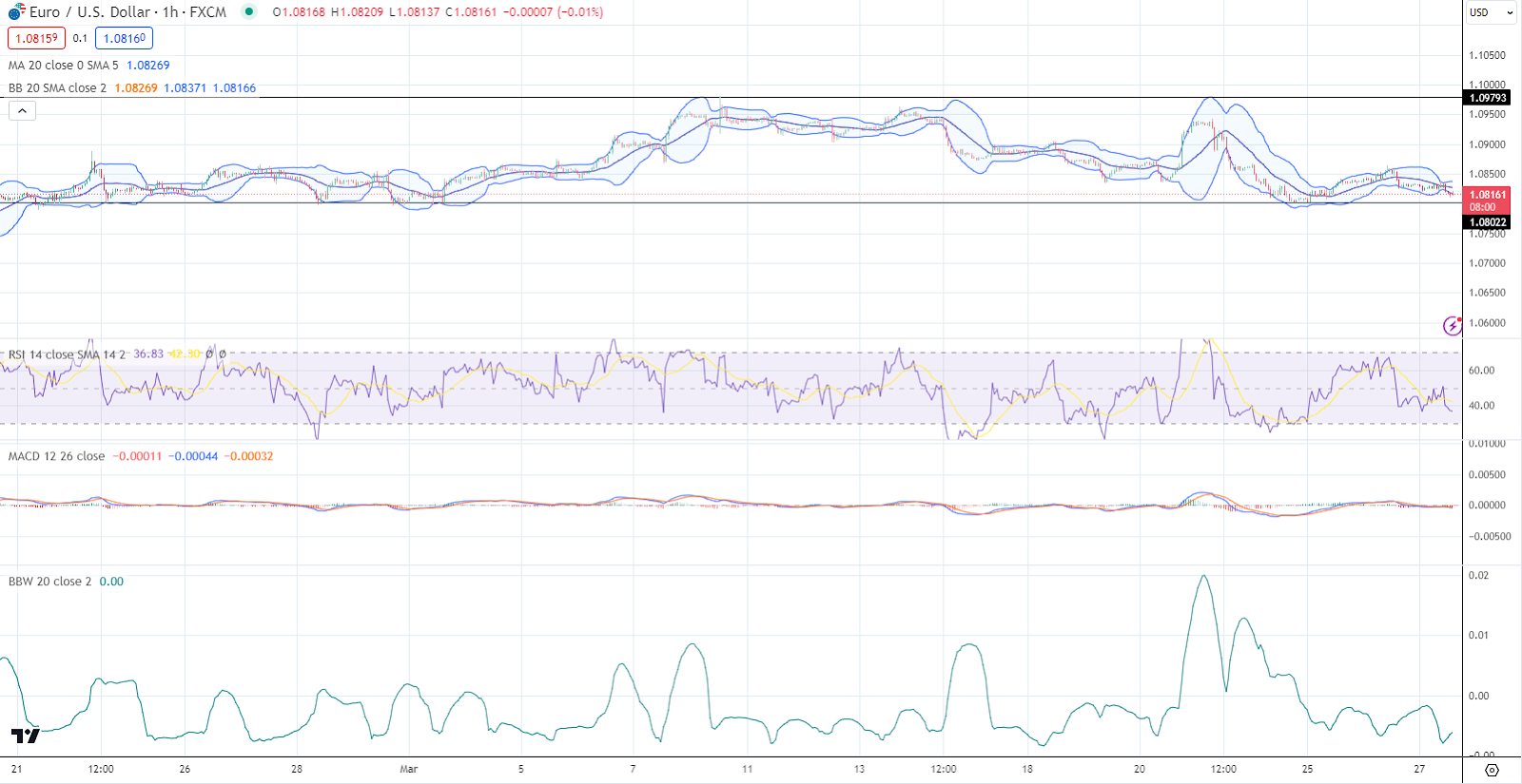
You can describe the movement of the EUR/USD currency pair during March as "going nowhere fast". The exchange rate continued a rally in early February and peaked in mid-March, returning to levels seen at the beginning of the short rally (see chart). Looking at it from a broader perspective, you can see that the exchange rate has been rangebound after a selloff that began in July 2023. The short-term intra-day one-hour view of March also shows prices are moving sideways. While the price action reflects a sideways view of the exchange rate, the currency pair appears to have a bearish pattern, which could lead to a rapid selloff.
What has helped move the exchange rate lower?
The European Central Bank (ECB) has fine-tuned its monetary policy framework in response to shifting inflation trends and economic circumstances. The ECB has articulated that the central bank's overarching aim is the practical reduction of inflation to align with the bank's medium-term objective. Further, the ECB president wants a resilient strategy that relies on a systematic, data-informed policy decision-making process. Tightening appears in the rearview window, and easing is next up. At the same time, the Federal Reserve is moving toward a neutral policy. According to the Federal Reserve's dot plots and the market outlook reflected by the CME Fed Tool Watch, the next move is likely a cut.
The intra-day chart in March

The March intra-day chart shows that prices throughout the third month of the year moved up and down, and month over month, they are likely to be unchanged. The exchange rate tested highs near 1.0980 a few times and reversed and tested the bottom end of the intra-month range at 1.08. A few times, the FX trade would have moved out of the hourly Bollinger bands, and the Bollinger band width is lower than the 1-month range.
What are Bollinger Bands
Bollinger Bands is a technical analysis tool developed by John Bollinger in the 1980s. They are used to measure market volatility and to identify overbought or oversold conditions for a security. The tool consists of three lines plotted in and around the price structure on a chart.
The middle band is typically a simple moving average (SMA) that serves as a base for the upper and lower bands. Depending on the chart, it's often set to 20 periods, which can be days, weeks, hours, etc..
The upper band is calculated by adding a standard deviation multiplier (usually two standard deviations) to the middle band (SMA). The lower band is found by subtracting the same standard deviation multiplier from the middle band (SMA).
The width of the bands is a guide to the asset's volatility. Narrow bands suggest low volatility and wide bands indicate high volatility. When prices move closer to the upper band, the asset may be considered overbought, and when they move closer to the lower band, it may be considered oversold.
After a price move starts from one of the bands, it will often reach the opposite band. This scenario can be used to set profit targets or entry/exit points. A "Bollinger Band squeeze" is a strategy that looks for periods of low volatility, indicated by the bands coming closer together, as this might be the precursor to a significant breakout in either direction. A Bollinger Band bound is based on the idea that the price tends to return to the middle of the bands. So, if the price deviates to the lower band and bounces back, traders might see it as a signal to buy.
Bollinger Bands are often used with other technical indicators to confirm or deny a trade signal. It's important to note that, like all trading indicators, Bollinger Bands are not foolproof and are best used with other indicators and analysis methods.
What are Bollinger Band widths?
Bollinger Band Width is a technical analysis indicator derived from Bollinger Bands. It measures the difference between the upper and lower Bollinger Bands, providing a quantitative value indicating the degree of market volatility. The bandwidth is simply the numerical difference between the upper and lower bands' values at any time.
To calculate Bollinger Band Width, you subtract the value of the lower band from the value of the upper band, Bollinger Band Width = Upper Band - Lower Band.
The middle band, usually a simple moving average, is not involved in calculating the Band Width.
A wider bandwidth indicates greater volatility, with the exchange rate moving significantly and the bands expanding. Conversely, a narrower bandwidth suggests lower volatility, with price movements becoming more confined and the bands contracting.
Traders and analysts use Bollinger Band Width for a variety of purposes. For example, Identifying periods of high or low volatility. Anticipating future volatility increases (often after periods of low volatility, sometimes referred to as a Bollinger Bands Squeeze). Making decisions about entry and exit points for trades based on volatility conditions. Like all indicators, Bollinger Band Width is best used with other indicators and methodologies to enhance the reliability of trading signals and strategies.
The patterns
The daily chart of the EUR/USD has been moving sideways but seems to be forming a head-and-shoulders reversal pattern. The purple arrows on the chart show the two shoulders, and the red in the middle is the head.
A head and shoulders pattern is a chart formation used in technical analysis to predict a potential reversal in the current trend. This pattern is one of the more reliable trend reversal formations and is typically associated with a change from a bullish to a bearish trend. The pattern has three tops, one higher than the other two in the middle, the head in the middle.
The left shoulder forms during an uptrend as prices peak and then decline to a trough. After the trough, prices rise again to form a higher peak before falling again, creating the 'head,' higher than the left shoulder. The price rises again after the head, but not as high as the head, forming the right shoulder. The peak of the right shoulder is typically in line with the left shoulder.
This support line is drawn by connecting the lowest points of the two troughs (the trough between the left shoulder and the head and the trough between the head and the right shoulder). A head and shoulders pattern is confirmed when the price breaks below the neckline after forming the right shoulder.
The reversal signal is strongest when the neckline slopes down. The pattern is complete, and the signal is confirmed when the price drops below the neckline after forming the right shoulder, indicating that a bearish trend may follow. The depth of the head from the neckline can be subtracted from the breakout point on the neckline to provide a potential price target to the downside.
In contrast, there is an inverted head and shoulders pattern, which signals a reversal from a downtrend to an uptrend. It has the same structure but flipped upside down, with the head forming a trough, the shoulders forming lower peaks, and the neckline being a level of resistance broken to confirm the bullish trend reversal.
Negative momentum is accelerating
Negative momentum is accelerating as the MACD (moving average convergence divergence) index generated a sell signal in March. There are many different ways to use the MACD to identify a sell signal. For example, when the MACD line crosses below the signal line, as seen in the chart. The most common sell signal within the MACD framework occurs when the MACD line (the difference between the 12-period and 26-period EMAs) crosses below the signal line (the 9-period EMA of the MACD line). This crossover suggests a potential change from a bullish to a bearish trend.
Additionally, if the MACD line crosses below the zero line, the 12-period EMA has crossed below the 26-period EMA, signifying a potentially bearish trend momentum.
When the price of an asset makes higher highs, but the MACD makes lower highs, it's called a bearish divergence. This situation is often interpreted to mean the upward price momentum is weakening, and a downward reversal might be imminent.
When the MACD histogram plots the distance between the MACD line and the signal line. If the histogram moves from positive to negative (below the zero line), this can also be taken as a bearish signal.
The bottom line
A lack of clear direction can characterize the EUR/USD currency pair's trajectory throughout March, as its movement was relatively stagnant. Taking a step back for a more comprehensive view reveals that after a decline starting in July 2023, the exchange rate has been trapped within a confined trading range. Despite the overall sideways trend discernible in the exchange rate's recent behavior, an underlying bearish pattern can precipitate an abrupt downturn in value if the head and shoulder pattern leads to a quick selloff.
This article is sponsored content
Author

iForex Team
iForex
iFOREX was founded in 1996 and is one of the largest and most respected brokers in the industry.