The Fed Is Full of It. The Yield Curve Is Not
Sometimes we get so caught up in what’s happened over the last few days, weeks, or months, we fail to see the bigger picture.
Perspective is key. Lose it, and you might as well give up on any long-term planning.
When we do take a longer view, we can avoid short-termism and make better investment decisions.
That requires serious discipline. But what if I told you there’s an easier way to appreciate the future of our economy, one that doesn’t include talking heads and iPhone news alerts?
There’s no perspective to be gained – on markets, investing, the economy, or anything, really – from your TV or your mobile device.
There is, however, a smart and simple way to see if the economy’s heating up or cooling down.
I’ll get to that in a minute…
First, let’s take a look at how stocks have performed over the last five years. Based on stock performance alone, you’d think our economy is firing on all cylinders, that maybe the Federal Reserve should be concerned, even, about an irrationally exuberant economy.
I mean, just look at the S&P 500 Index.
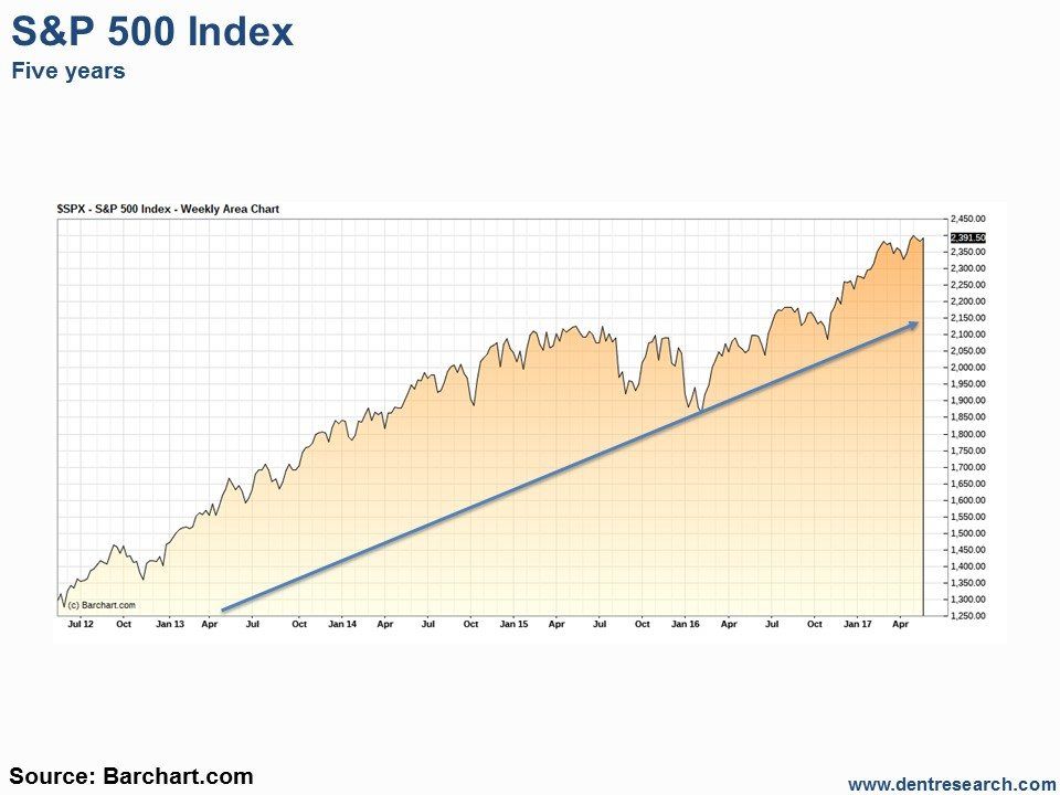
Pretty straight forward, right? I mean, we’re sitting close to all-time highs!
Stocks can be pushed higher because of various factors, among them low interest rates, positive investor sentiment, good corporate earnings, stock buybacks, and the overall economic outlook.
That last factor is historically the most important. And if you’re at all familiar with the way the Fed rolls, you know it has an outsized impact on “the economic outlook.”
Through action (artificially low interest rates, quantitative easing) or even just talk (speech after speech from governor after governor downplaying recent data, for example), the Fed has been able to influence the countless decisions that determine the state of the economy.
But here’s the thing: For the past eight or so years, stocks have only needed the belief that the Fed would step in and save the day. That’s how warped the relationship between the Fed and markets has become.
The Fed ended its QE program (bond buying with money created out of thin air) two-and-a-half years ago. It’s even raised the benchmark federal funds rate three times since December 2008, from zero to 1.0%.
But the Fed’s still cautious about moving rates too high, too fast, as an aggressive tightening cycle could stall growth entirely. Whether Fed officials admit it in their public remarks or not, recent economic suggests we could be teetering on a pullback.
Let’s step back again and take a look at where long-term Treasury rates have moved over the past five years.

This image strongly suggests that every time the Fed has moved to tighten policy, long-term rates have fallen.
That’s the precise opposite of what the Fed intended.
Unlike stocks, there’s no clear trend in long-term interest rates. The only thing we can take away from the chart above is that the Fed might have some credibility issues.
And now, back to that reliable indicator of the future health of our economy. Take a look at the chart below.
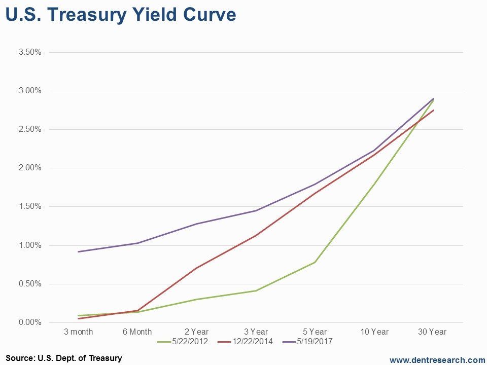
The Treasury yield curve (or the difference between long-, medium-, and short-term rates) can tell us a lot about the outlook for our economy.
A steepening yield curve tells us future growth is expected to be higher. Longer-term rates are much higher than shorter-term rates because inflation is expected to get hotter along with the economy.
Five years ago, long-term interest rates were just about where they are now, and short-term rates were nearly as low as the overnight federal funds rate (that is to say, at zero).
At the end of 2014, when the Fed ended QE, short-term rates didn’t move much. But the middle of the yield curve moved higher. Again, long-term yields are nearly the same today as they were in 2014.
Finally, the current yield curve looks much flatter. Short-term yields moved higher, mirroring the Fed’s rate hikes, and the middle of the curve has drifted higher. But long-term rates are about where they were five years ago!
That’s not encouraging. Markets don’t believe there’s much risk of inflation or economic growth.
In other words, the market doesn’t believe the Fed… ouch!
It seems all the shenanigans of QE and the artificial suppression of interest rates to create inflation and jobs since 2008 have been a waste.
(Well, the Fed did create a $4.5 trillion balance sheet in the process. With friends like these…)
The more the Fed tries to “normalize” interest rates, the more pressure it puts on the economy. If and when it reduces the $4.5 trillion mess it created, even more pressure will be applied.
The data can tell us a lot about what’s going on, but, ultimately, we have to connect the dots. We need to figure out whether trends are developing or if the data is “transitory”… that’s the term the Fed has thrown around lately, when the data hasn’t fit with its projections.
If you’re looking for an indicator that sheds light on the overall economic environment, don’t look at stock market trends.
And please – please – don’t look at Fed projections!
Just take a look at what the yield curve is doing. If it’s flattening, there’s a potential slowdown or maybe even a recession ahead. If it’s steepening, we can all breathe easier.
Author

Dent Research Team of Analysts
Dent Research